The Drop · July 14, 2026
The best free fonts for music videos and edits (and when to use each)
The typeface on screen tells people what the song is before they hear a bar of it. A cracked blackletter reads as phonk. A tight condensed capital reads as a type beat drop. Here is a plain guide to picking fonts for music videos, sorted by the sound you are making, plus the one readability rule most edits get wrong.
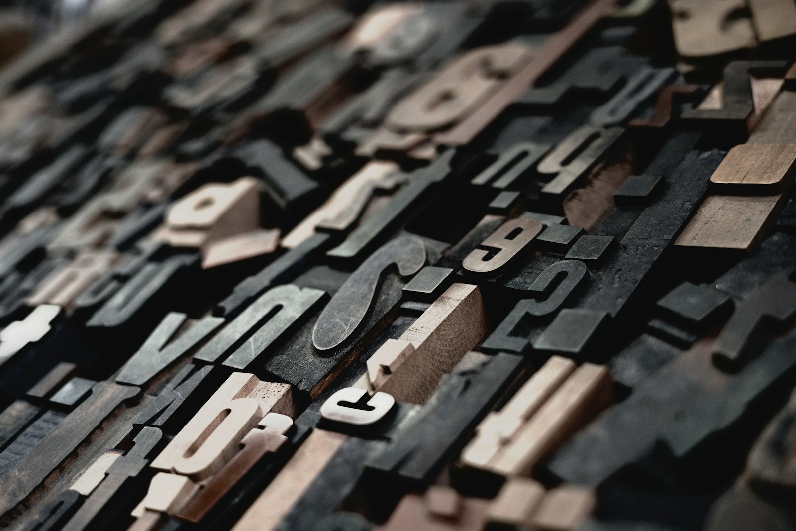
Photo via Unsplash
Font choice is the fastest style signal you have. Before the first flash lands, the shape of the letters has already put your clip in a genre. Every font in the Flash Visualizer app is a free, open-source display face, fifty of them self-hosted so nothing phones home, and you tick which ones rotate. So the real question is not where to find fonts, it is which one fits the track. Below is how the families break down.
Start with one rule: one font per line, not one per video
The most common mistake in a lyric or beat edit is switching typeface on every single word so the screen turns into a ransom note. Pick a lead font that carries the whole edit and let the energy come from the motion, the color and the cuts instead. If you do want variety, cap it at two: a loud display face for the hook word and a cleaner one for the rest. In the app you get this by ticking only one or two fonts in the fonts panel. The picker shuffles a deck of the checked fonts and reuses them per word, so leaving three faces on looks intentional while leaving twenty on looks like an accident.
Phonk and drift edits: blackletter and gothic
Phonk lives on blackletter. Those spiky medieval capitals are the whole visual language of the genre, and the app ships UnifrakturCook for exactly this. It renders in title case rather than all caps on purpose, because a full line of blackletter capitals is close to unreadable, and a Memphis phonk edit wants a word you can still parse at speed. Pair it with drum-triggered cover art and the bass-drop glitch and you have the look the phonk edit guide walks through step by step.
Trap, drill and hip hop: heavy slab and hand styles
Trap and drill want weight and street texture, not elegance. Reach for a fat slab like Alfa Slab One or Ultra when you want the name to sit on screen like a chrome plaque, and switch to a hand style like Permanent Marker or the graffiti-flavored Sedgwick Ave Display when the edit is rawer and more DIY. Marker faces read as urgent and a little rebellious, which is why they suit aggressive verses. For a beat you are selling, a clean condensed capital keeps the artist name legible over busy footage, which the type beat visualizer guide gets into.
EDM, techno and future bass: geometric and techno faces
Electronic music reads best in geometry. Orbitron, Audiowide, Michroma and Zen Dots all carry that circuit-board, sci-fi feel that fits festival EDM and club techno, and their even stroke weight holds up when the screen is strobing behind it. Monoton, with its hollow tube-light strokes, is a neon sign in a single word and works beautifully for a synthwave or retrowave title card. Keep these to short lines. Geometric faces look sharp on a two-word hook and turn into a wall on a full sentence.
Metal, hardcore and darker edits: horror and rough faces
For heavier and darker material the app carries a small horror set: Metal Mania, Nosifer, Creepster and Eater. These are dripping, cracked, distressed letterforms that match metal, doom, horrorcore and darker drift edits. Use them sparingly. A horror face on the title hits hard, but running a whole lyric in Nosifer is a legibility problem, so drop back to a plain bold face for the lines you actually want people to read and save the scary font for the name.
Retro, hyperpop and 8-bit: pixel and Y2K faces
Pixel type is having a long moment. Press Start 2P, VT323, Silkscreen and DotGothic16 give you that arcade and old-terminal look that fits hyperpop, chiptune, nightcore and any edit leaning into gaming nostalgia. Faster One and Righteous cover the groovier retro and Y2K end if you want speed lines and chrome rather than pixels. Pixel faces are tiny by design, so size them up and keep the line short, since a low-resolution letterform loses its edges fast when it gets small on a phone screen.
When readability has to win
All of the above is style, but style loses to legibility the second a viewer cannot read the hook. Three things protect it. Keep the line short, three or four words at most, because a display font is a poster face, not a paragraph face. Keep contrast high, light text on a dark scene or the reverse, so the letters do not vanish into a busy frame. And when in doubt, fall back to a bold condensed capital like Anton, Bebas Neue, Oswald or Teko. Those are the workhorses that stay readable on any track, which is why Anton is the app's default. If you tick every font off, it quietly falls back to Anton rather than leaving you with nothing.
One practical note if you plan to leave text on for a live crowd. Text can flash and blink in the app, and fast full-screen flashing can trigger a seizure in someone with photosensitive epilepsy, so keep flashing to no more than about three flashes a second when you cannot screen your audience. A slower blink on a bold word still reads as energetic without the risk. And if a clean backdrop is what you actually want, leave the text box empty entirely and let the shapes carry it, which is one of the moves in the customize your visualizer guide.
The short version: match the family to the sound, keep the line short and readable, and let one font do the talking. Then render it and the words are baked into a 1080p WebM with the audio, free and with no watermark, ready to post.
Try the fonts on your own track
Fifty free display fonts, tick the ones you want, watch them land on the beat. Free, in the browser, 1080p WebM.
Open the visualizer